Parlour*NOUN – a room in a private house or establishment where people can sit, talk and relaxOur home is a conduit for ideas, collaborations, connections and endless stories. So we think It’s only fair that we have a space dedicated to sharing this information with the community. Our ‘parlour’ gives you an inside look into the discussions that happen within the walls of our house and beyond.
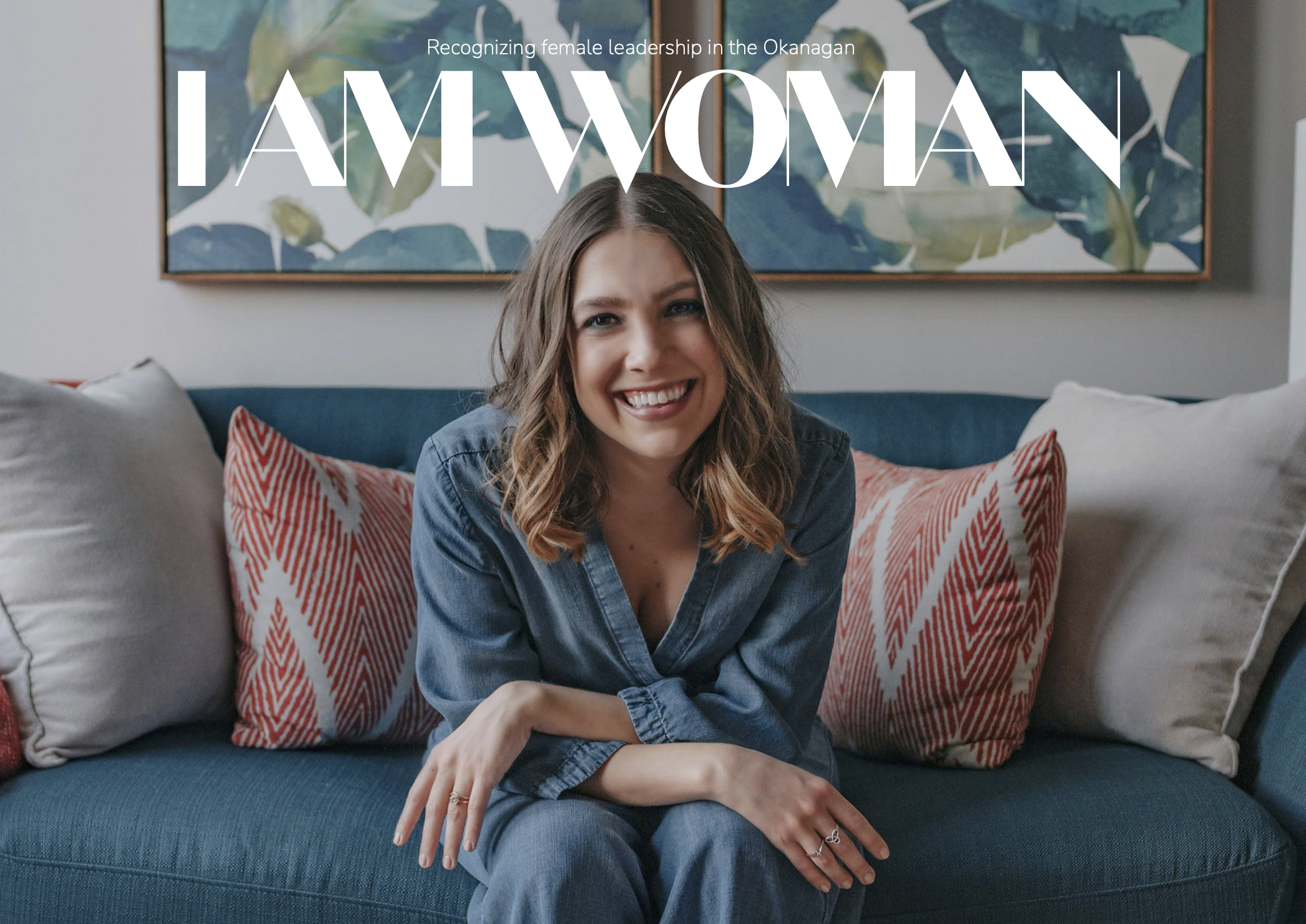
What you will find:Captivating stories, interviews, useful insights,
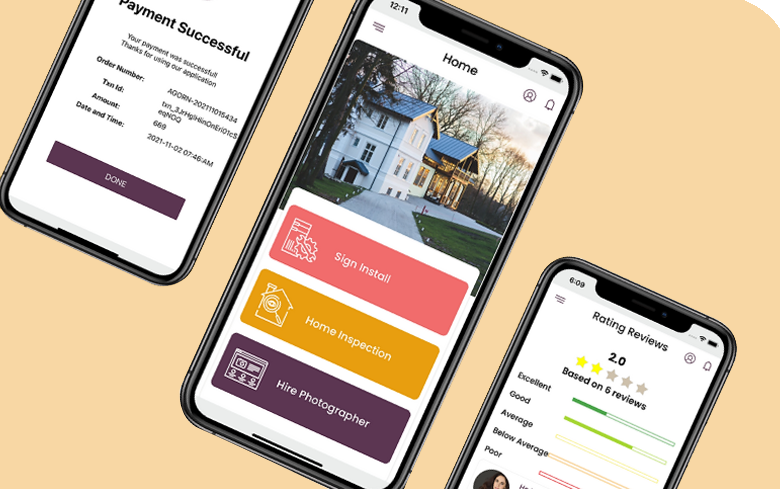
marketing projects, bold ideas, community collaborations, exciting visuals and internal updates (only the fun kind)
What you won’t find:Jargon overload, promotional material, clickbait titles with no substance, lack of visuals or ads, boring subjects and generic office stock images.